Code
import numpy as np
import pandas as pd
import scipy
import matplotlib.pyplot as plt

import soundfile
from IPython.display import Audio, displayEmily Graber
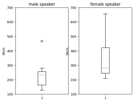
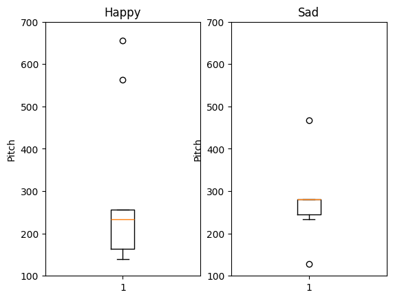
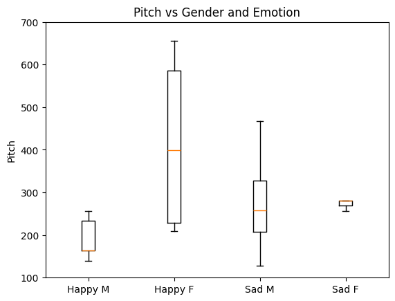
Cochlear implant users often have difficulty distinguishing the gender and emotion of the person they are talking to on the phone when no visual cues are present. They feel a lack of control that builds over time. Doctors and cochlear implant manufacturers would like to find a solution to assist their patients’ and customers. Part of the trouble is that the microchips that do processing on the implants are only able to process very basic features of the audio, however the features that enocode emotion and gender cues may not be basic features. Here we will try to understand what might be going wrong on the audio chips. In a first step, we will take a computational approach to analyzing several audio files that contain sentences expressed with happiness and sadness by male and female speakers. The most salient pitch and amplitude were extracted from each file. Using only these two features to classify four categories of happy female, happy male, sad female, and sad male, the sentences are not correctly classified. This suggests that more than pitch and amplitude may be need to be processed in order to accurately classifying gender and emotion. Further development of audio processing algorithms that can capture more than pitch and amplitude would likely be helpful to untangle the differences in vocal samples and aid cochlear implant users.
Audio samples containing happy and sad speech from male and female speakers were downloaded from the Ryerson Audio-Visual Database of Emotional Speech and Song (RAVDESS). The database overall contains 7356 files of 24 professional actors (12 female, 12 male), speaking two sentences with a number of different emotions and intensities. Only the happy and sad data from the actors were analyzed. These emotions were selected because they are typically easy to identity for normal-hearing subjects without using any visual cues. For cochlear implant users, identification based on audio alone is much more challenging.
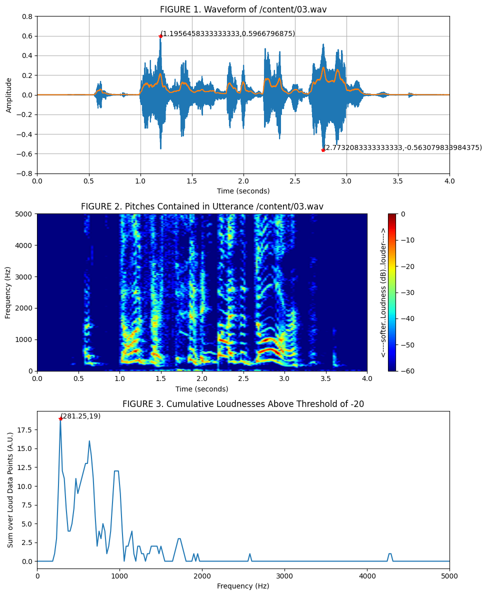
The wave files from the dataset were downloaded and audio transformations were applied to extract the most salient amplitude and pitch from each file. One audio file is shown below along with transformations that facilitated the pitch and amplitude extraction process.
The most salient amplitude was read off of the raw audio waveform (Figure 1) while the most salient pitch was read off of a truncated spectral representation of the audio (Figure 3).
In [1]:
In [3]:
# TODO: specify the file to explore
# set 01.wav at the end, or 02.wav, 03.wav etc

! wget https://github.com/allegheny-college-cmpsc-105-spring-2025/site/raw/refs/heads/main/data/data-RAVDESS-audio/03.wav &> /dev/null
! wget https://github.com/allegheny-college-cmpsc-105-spring-2025/site/raw/refs/heads/main/data/data-RAVDESS-audio/04.wav &> /dev/null
In [5]:
In [10]:
In [16]:
# Controls for Visualizations

# TODO: change these as needed to explore the data up close or zoomed out
time_limit = (0, 4) # bounds on time range in seconds

# TODO: change these as needed to explore the data up close or zoomed out
amplitude_limit = (-0.8, 0.8) # bounds on audio sample height

# TODO: change these as needed to explore your data up close or zoomed out
freq_limit = (0, 5000) # bounds on pitch range in Hz

# TODO: update loudness threshold as needed for exploration
loudness_threshold = -20

# # Summary
# print("Summary for: ", filename)
# print("----------------------")
# print("time limit is ", time_limit)
# print("amplitude limit is ", amplitude_limit)
# print("frequency limit is ", freq_limit)
# print("loudness threshold is ", loudness_threshold)
In [22]:
# Plotting

plt.close('all')

plt.figure(figsize=(10,4*3))

# Top Plot
plt.subplot(3,1,1)
plt.plot(t, y) # layer one, line plot
plt.grid()
plt.plot(t[np.argmin(y)], y[np.argmin(y)], 'r*');
plt.annotate(f"({t[np.argmin(y)]},{y[np.argmin(y)]})", (t[np.argmin(y)], y[np.argmin(y)]))
plt.plot(t[np.argmax(y)], y[np.argmax(y)], 'r*');
plt.annotate(f"({t[np.argmax(y)]},{y[np.argmax(y)]})", (t[np.argmax(y)], y[np.argmax(y)]))
plt.xlabel("Time (seconds)")
plt.ylabel("Amplitude")
plt.title(f"FIGURE 1. Waveform of {filename}")
plt.xlim(time_limit)
plt.ylim(amplitude_limit)
plt.plot(t, np.sqrt(np.convolve(np.power(y,2), 0.001*np.ones(1000), mode="same")))

# 2nd Plot
plt.subplot(3,1,2)
plt.imshow(Y_dB,
           origin='lower',
           vmin = -60, vmax = 0,
           aspect='auto',
           cmap='jet',
           interpolation='spline16',
           extent=[T[0], T[-1], F[0], F[-1]])
cbar = plt.colorbar(location="right")
cbar.ax.set_ylabel('<----softer..Loudness (dB)..louder---->', labelpad=-50)
plt.xlabel("Time (seconds)")
plt.ylabel("Frequency (Hz)")
plt.title(f"FIGURE 2. Pitches Contained in Utterance {filename}")
plt.xlim(time_limit)
plt.ylim(freq_limit)

# 3rd Plot
spectrum_full = np.sum(Y_dB, axis=1)

# 4th Plot
Y_dB_loud = Y_dB >= loudness_threshold

# Bottom Plot
spectrum = np.sum(Y_dB_loud, axis=1)
plt.subplot(3,1,3)
plt.plot(F, spectrum)
plt.plot(F[np.argmax(spectrum)], spectrum[np.argmax(spectrum)], 'r*');
plt.annotate(f"({F[np.argmax(spectrum)]},{spectrum[np.argmax(spectrum)]})", (F[np.argmax(spectrum)], spectrum[np.argmax(spectrum)]))
plt.title(f"FIGURE 3. Cumulative Loudnesses Above Threshold of {loudness_threshold}")
plt.xlabel("Frequency (Hz)")
plt.xlim(freq_limit)
plt.ylabel("Sum over Loud Data Points (A.U.)")


plt.tight_layout()

# reaveal everything
plt.show()
The extracted pitch and amplitude data were stored in a new dataset. The original speaker gender and emotion were also recorded ito the new dataset. The new data set was then further processed.
In [23]:
# The figures above have some salient peaks that are significant for understanding
# what might be going on with audio pitch processing in cochlear implants

# Below are some variables containing observations coming from the audio graphs
# The filenum is the filename number
# max_abs_amplitude is the peak in the first figure
# most_common_freq is the peak in the third figure
# vocal_gender is based on your judgment from listening without using cochlear implants
# vocal_emotion is happy or sad, based on your judgement from listening without using cochlear implants

# TODO: run the code above and record the data points for all 24 files!

filenum = [1,2,3,4,5,8,9,15,16,17,18,19,20,21,22,23]
max_abs_amplitude = [.127,.2402,.596,.262,.155,.6,.2,.1,.19,.324,.042,.025,.143,.16,.068,.057]
most_common_freq = [128,257,281,281,234,281,468,234,234,140,656,164,563,257,210,164,]
vocal_gender = [0,1,0,1,0,1, 0, 0, 1, 0, 1, 0, 1, 0, 1, 0]
vocal_emotion = [1,1,1,1,1,1,1,0,0,0,0,0,0,0,0,0]
In [24]:
# Assuming all the variables are filled out, reformat the data...

data = {'filenum': filenum,
        'max_abs_amplitude': max_abs_amplitude,
        'most_common_freq': most_common_freq,
        'vocal_gender': vocal_gender,
        'vocal_emotion': vocal_emotion
        }

# TODO: pass data into a dataframe
df = pd.DataFrame(data)
# TODO: print the df
print(df)
filenum max_abs_amplitude most_common_freq vocal_gender vocal_emotion
0 1 0.1270 128 0 1
1 2 0.2402 257 1 1
2 3 0.5960 281 0 1
3 4 0.2620 281 1 1
4 5 0.1550 234 0 1
5 8 0.6000 281 1 1
6 9 0.2000 468 0 1
7 15 0.1000 234 0 0
8 16 0.1900 234 1 0
9 17 0.3240 140 0 0
10 18 0.0420 656 1 0
11 19 0.0250 164 0 0
12 20 0.1430 563 1 0
13 21 0.1600 257 0 0
14 22 0.0680 210 1 0
15 23 0.0570 164 0 0In [25]:
# make a plot of freq of male speakers and female speakers
plt.figure()

plt.subplot(1,2,1)
plt.title('male speaker')
plt.ylabel('Pitch')
plt.ylim(100,700)
plt.boxplot(df.most_common_freq[df.vocal_gender==0])

plt.subplot(1,2,2)
plt.title('female speaker')
plt.ylabel('Pitch')
plt.ylim(100,700)
plt.boxplot(df.most_common_freq[df.vocal_gender==1])

plt.show()
In [33]:
# make a plot of freq of happy speakers and sad speakers
plt.figure()

plt.subplot(1,2,1)
plt.title('Happy')
plt.ylabel('Pitch')
plt.ylim(100,700)
plt.boxplot(df.most_common_freq[df.vocal_emotion==0])

plt.subplot(1,2,2)
plt.title('Sad')
plt.ylabel('Pitch')
plt.ylim(100,700)
plt.boxplot(df.most_common_freq[df.vocal_emotion==1])

plt.show()
In [27]:
# make a plot with all four separated

plt.figure()

plt.title('Pitch vs Gender and Emotion')
plt.ylabel('Pitch')
plt.ylim(100,700)

plt.boxplot(df.most_common_freq[(df.vocal_emotion==0) & (df.vocal_gender==0)], positions=[1]) # happy and male
plt.boxplot(df.most_common_freq[(df.vocal_emotion==0) & (df.vocal_gender==1)], positions=[2]) # happy and female
plt.boxplot(df.most_common_freq[(df.vocal_emotion==1) & (df.vocal_gender==0)], positions=[3]) # sad and male
plt.boxplot(df.most_common_freq[(df.vocal_emotion==1) & (df.vocal_gender==1)], positions=[4]) # happy and female

plt.xticks([1,2,3,4], ["Happy M", "Happy F", "Sad M", "Sad F"])

plt.show()